Top Arts: VCE 2007
Free entry
The Ian Potter Centre: NGV Australia, Fed Square
Ground Level
27 Mar 08 – 9 Jun 08
A major event in the annual school calendar, Top Arts: VCE 2007 presents outstanding work completed by young student artists as part of their assessment for VCE Art and Studio Arts.
VCE Art requires students to complete a body of works that involves a broad and innovative investigation and the progressive realisation and resolution of ideas, directions and individual concepts, either in an exploratory folio or through one or more visual solutions. VCE Studio Arts requires students to complete a design process that defines an area of exploration in a work brief and the production of a cohesive folio of finished works of art.
This exhibition highlights the NGV’s strong commitment and support of contemporary art, arts education and showcases the ideas and attitudes of young people.
Leah Wallace

Leah Wallace
Metal shed roller door 2007
pastel
78.5 x 38.0 cm (image)
Westbourne Grammar School, Truganina
Art
Westbourne Grammar School, Truganina
My theme was discarded objects and buildings left to disintegrate. This metal shed door was located in an abandoned water-tower yard, and so rust and decay were clearly visible from years of weathering. I originally took photos and then emphasised areas of colour and shape to create the works. By exaggerating colours, making them extremely bright, it becomes appealing and attractive, creating a focus. My aim is for people to notice disused objects and sites.
Verity Willmott
Verity Willmott
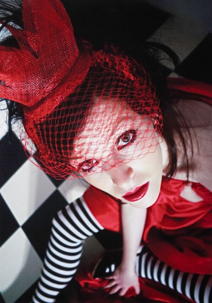
Untitled 2007
inkjet print
58.5 x 41.0 cm (image)
St Helena Secondary College, Eltham North
Art
St Helena Secondary College, Eltham North
I created theatrical works based on Alice in Wonderland, showing a more macabre and theatrical view of the story than we realise as children. The story is quite sinister, with underlying themes of drug taking, child abuse, and possible mental illness in the Queen of Hearts’ behaviour depicted as temper tantrums. In this image of the Queen, I focused on formal elements and qualities, such as line, colour, contrast, tone, texture and pattern.
Rhianon Hall
Rhianon Hall
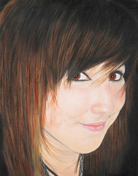
Sammy 2007
oil on canvas
35.5 x 27.5 cm
Berwick Secondary College, Berwick
Art
Berwick Secondary College, Berwick
I wanted to create a folio of portraits based on the theme of people, friendship and beauty. I refined this to include portraits of important people in my life such as my friends. I used photography, then Photoshop to re-size and crop the images. I used oil paint on canvas board after various trials with other paints and found it easy to mix the colours and apply. The difficulties were the time it took to dry and the challenge of creating realistic and accurate portraits. This is my friend Sammy.
Robert Richards
Robert Richards
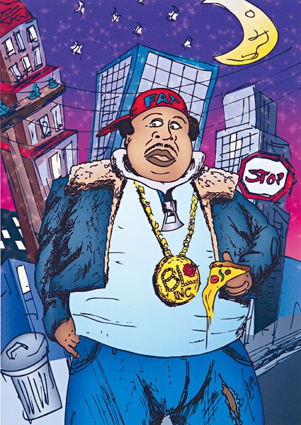
Fat man 2007
inkjet print
36.4 x 25.8 cm (image)
Seymour Technical High School, Seymour
Art
Seymour Technical High School, Seymour
Fat man came out of developmental work for my major project, which was to create a children’s picture book. I created numerous sketches in pencil, fine-liner, gouache and coloured pencil to explore character development, facial expression, costume and backgrounds. I called upon my knowledge of Illustrator, scanning the hand-drawn images onto the computer as a reference, then refining them using applications from the program to vary colour and create energy.
Lachlan Petras
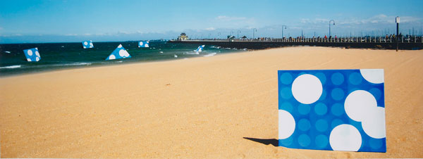
Lachlan Petras
Daylight conversations 2007
inkjet print
30.0 x 79.0 cm (image)
Geelong Grammar School, Corio
Art
Geelong Grammar School, Corio
In this series I tried to show the direct correlation between the people and the environment of St Kilda, and an artistic representation of this. The layered blue and white circles represent the constantly changing levels of conversational interaction during the day, free of the disturbances of the same interaction at night.
Saskia Baur-Schmid
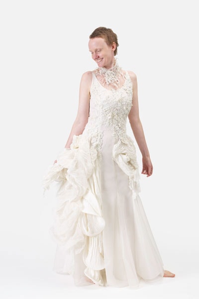
Saskia Baur-Schmid
Coastal environment L’environnement côtier 2007
silk, organza, knit jersey, georgette, beads
dress: centre front 126.4 cm, centre back 126.4 cm; jacket: centre front 24.0 cm, centre back 29.6 cm; neckpiece: 9.6 x 49.9 cm
Ballarat Grammar, Wendouree
Art
Ballarat Grammar, Wendouree
I studied the Australian landscape, particularly the endless variety of textures in coastal regions. While these landscapes may seem sturdy, my aim was to capture the fragility and delicacy within them and to reveal the minute details often overlooked in our hectic everyday lives. Seascapes inspired the design and construction of this piece of wearable art – natural environmental processes, the movement of the waves, and the debris washed up on the foreshore. I used tactile textures like silk and mulberry fibres, thermal manipulation, and hundreds of French knots and beads to create the sculptural forms.
Elana Harpur
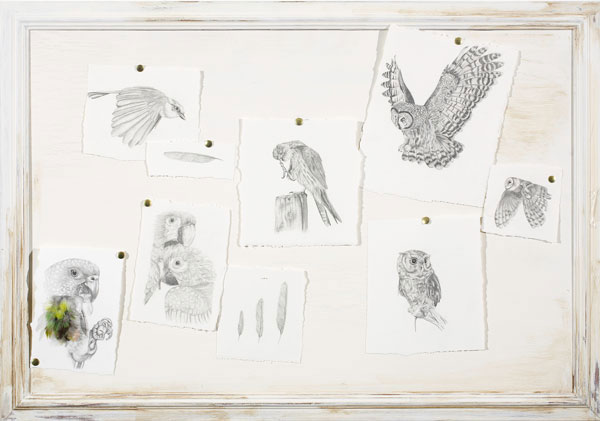
Elana Harpur
Untitled 2007
pencil, paper, metal pins, feathers on painted wood
58.0 x 83.0 x 2.5 cm
Braemar College, Woodend
Art
Braemar College, Woodend
I have always loved nature and the complexities of creation. I wanted to use my creativity and the artistic process to record natural objects, combining scientific aspects with precise observation and aesthetic awareness. Birds are my favourite creatures, and I think it is the minute details and intricacies that give them their character. I was inspired by botanical art and historical documents by naturalists, wanting my piece to possess a similar old-world or antique quality. I wanted to describe the humbling beauty and delicacy of God’s creations all around us.
Fiona Coath
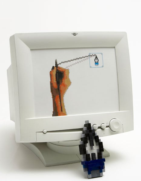
Fiona Coath
Untitled.jpg 2007
computer monitor, enamel paint, synthetic polymer paint, oil paint, paper, wood, fibre-tipped pen, coloured pencils
42.0 x 36.7 x 42.5 cm
Eltham College of Education, Research
Art
Eltham College of Education,Research
I explored the relationship between traditional art practices and digital art, specifically how digital rendering arose from traditional art forms. I examined six digital art programs or tools, and the corresponding traditional materials including spray paint, collage, oil paint, coloured pencils, synthetic polymer paint and fine-liner. The imitation of pixels, using media such as cross-stitch, plastic beads and wooden blocks in my developmental work, symbolised the relationship between the techniques. Placing the works in monitors further connected and framed the imagery within the digital environment.
Ashley Struck
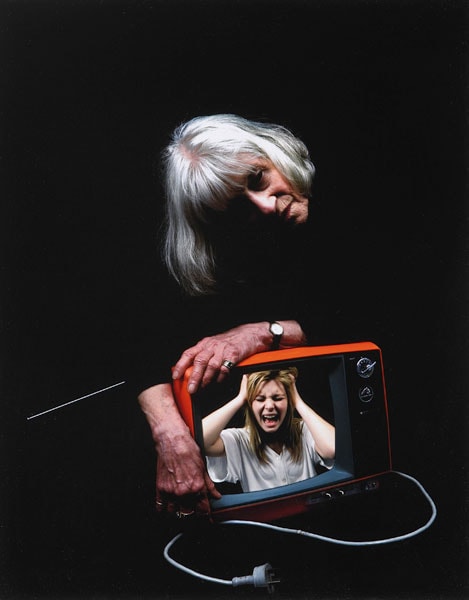
Ashley Struck
Obsolescence 2007
inkjet print
34.0 x 27.0 cm (image)
St Leonard’s College, East Brighton
Art
St Leonard's College, East Brighton
Obsolescence: the loss of value or usefulness usually over a period of time, because of wear, change or user preference; the state of becoming unwanted, being replaced by something new. I explored the notions of expiration and abandonment, and the effect this has on a visual world; the idea of a use-by date, the fixation on new technology, and the disposable aspects of modern life – people, technology, appliances. As my concept developed I became more interested in the human connection, in the emotional aspects of decay, the passing of time, and the way we dispose of things, including people.
Tim Ashby
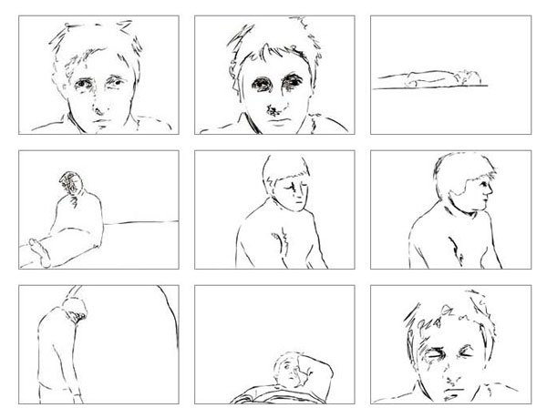
Tim Ashby
Portrait of myself 2007
black and white DVD, sound
2 min 43 sec
Upper Yarra Secondary College, Yarra Junction
Art
Upper Yarra Secondary College, Yarra Junction
My aim was to produce a self-portrait through capturing movement and mood, and to create a cohesive emotional state. Animation was the most appropriate form to express this artistically as it gives different takes on the subject, providing a more complex insight than a still, momentary portrait. I used Macromedia Flash and a Wacom graphics tablet, drawing each individual frame directly into the computer, which saved time in not having to scan pre-drawn cells. I utilised Rotoscoping combined with my own expressive line. I created my own music, playing acoustic guitar and recording on Digidesign.
Emma Fehring
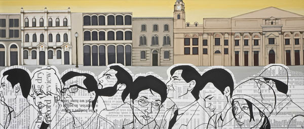
Emma Fehring
Collins Street 2007
oil and collage on canvas
91.0 x 214.0 cm
St Leonard’s College, Brighton
Art
St Leonard's College, Brighton
My work was inspired by John Brack’s Collins Street, 5pm . I wanted to capture both the hum-drum of the 9–5 workday and the bustle of commuters contrasted with the grand and timeless architecture in one of Melbourne’s oldest streets, and give it a modern twist. To highlight positive aspects of contemporary Melbourne I included people that reflect our cultural diversity, and represented old and young people, men and women. I mixed traditional oil painting with inkjet print, reinforcing the combination of old methods and new technologies.
Sophie McPike
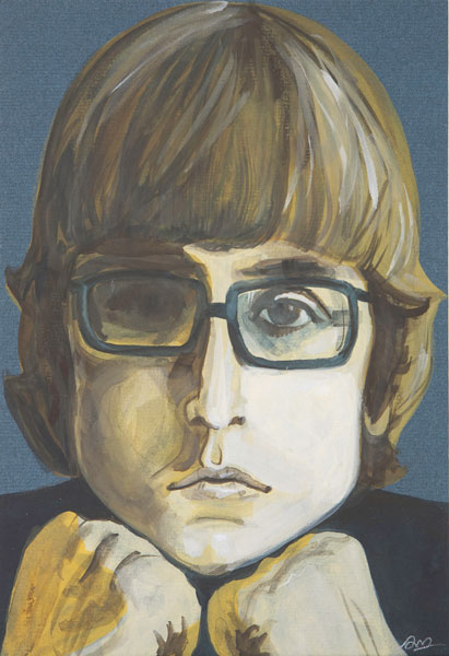
Sophie McPike
Chad 2007
gouache on card
23.7 x 16.2 cm
Sandringham College, Sandringham
Art
Sandringham College, Sandringham
Chad is approachable, passive and engaging. I have used a rough, pronounced application of paint, with little attempt to disguise my brushwork, to reflect the connection between the artist and the paint surface and between the viewer and subject. His face looms large and close to the audience due to his proximity to the picture plane, even though it is a small painting. Separated from the viewer, Chad exists comfortably behind the lenses of his glasses. The portrait was inspired by the music of Chad and Jeremy, a duo from the 1960s.
Keely Kelly
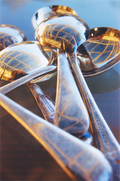
Keely Kelly
Untitled 2007
from The cutlery set series
inkjet print
45.0 x 30.0 cm (image)
Ave Maria College, Aberfeldie
Art
Ave Maria College, Aberfeldie
The engineering magnificence of the cutlery set has revolutionised eating habits the world over. This series was developed from a focus on everyday objects around the house. I wanted to take the ordinary and put it into a new concept, adapting varying lighting, focus, composition, camera angles and depth of field into this transition. I used Photoshop applications to refine some of the images. The result is my perspective of these everyday objects other than their bland necessity as part of the dinner table.
David Biro
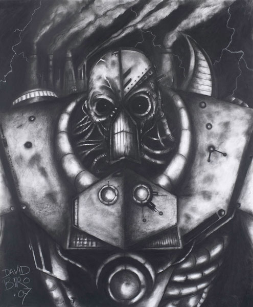
David Biro
Face of humanity (detail) 2007
charcoal
103.0 x 86.0 cm (image)
St Bede’s College, Mentone
Art
St Bede's College, Mentone
I wanted to amplify humanity’s abuse and overuse of technology. I have drawn a human figure consumed by machinery in an industrial, decaying environment, illustrating the brutal process on a large scale to create an impact. While machinery and robots inspired me as a child, I feel that technology is now playing too much of a role in our lives. It was challenging to make my message visible. Charcoal is my favourite medium. The variations of tone and the intense contrast that can be created were perfect for the dark nature of this piece.
Kai Allison
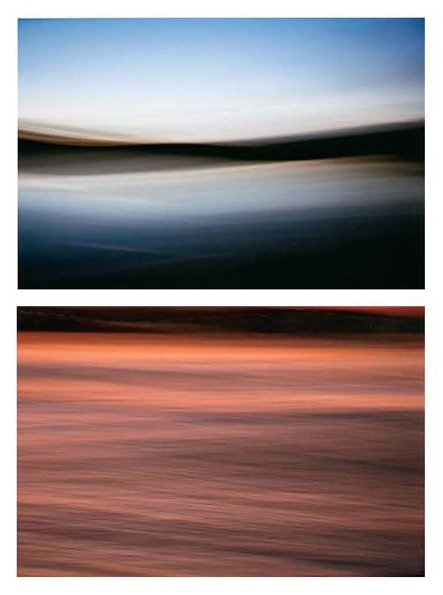
Kai Allison
Sunset on the bar 2007
inkjet print
30.8 x 46.3 cm (image) (each)
Mallacoota P-12 College, Mallacoota
Art
Mallacoota P-12 College, Mallacoota
In my series of works I focused on capturing the different moods and feelings suggested by the natural landscape, particularly the ocean. I used colour to create a sense of emotion and emphasised the blurring of light with camera movement. The effect is entirely created by the slow shutter speed and precise camera techniques, with no cropping or digital manipulation. I constantly waited for the right weather conditions and responded to subtle changes in the light by adapting the camera settings and continually refining my camera techniques.
Kara Kelly-Dalgety
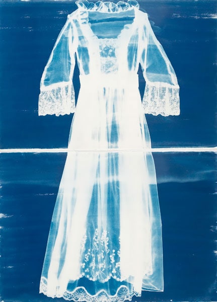
Kara Kelly-Dalgety
Tea gown 2007
two cyanotypes
157.0 x 111.5 cm (overall)
Sandringham College, Sandringham
Art
Sandringham College, Sandringham
Influenced by my mother, who is a big tea drinker, I developed my theme around tea drinking and the associated customs of many cultures throughout history, particularly in the late nineteenth century. I created a life-size cyanotype of a nineteenth-century English tea gown to highlight the importance of ritual and beauty associated with the experience of drinking tea. The piece illustrates the delicacy, design and ethereal beauty of the gowns associated with the English tea-drinking culture. The ghostly nature of the image further adds to the historical placement of the gown.
Edwina Sangster
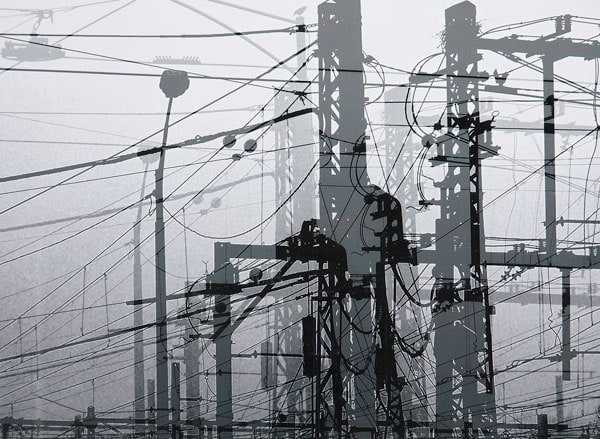
Edwina Sangster
Air É or no air 2007
inkjet print
28.0 x 38.0 cm (image)
Ballarat Grammar, Wendouree
Art
Ballarat Grammar, Wendouree
My inspiration came from the experience of living on a farm for seventeen years followed by a move to an urban environment. This relocation and the exposure to a new world of high-density expansion were the catalysts for my interest in environmental issues such as the impact of power emissions associated with new developments. The work of Gordon Bennett was influential in revealing new ways of making social commentary and telling stories. I used Adobe Photoshop to manipulate the image.
Simon O'Brien
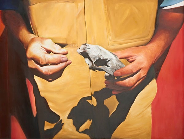
Simon O’Brien
Fox skull 2007
oil on canvas
182.0 x 137.0 cm
St Leonard’s College, Brighton
Art
St Leonard's College, Brighton
After a visit to a bush setting near Kyneton, I was inspired to create a piece based on an Australiana theme. I set out to produce a painting that highlighted the vulnerability of Australia’s wildlife – even feral species. I also wanted to capture and reflect the raw qualities of the Australian bush in my work. I used a photo-realistic style, applying the paint in different ways to achieve varying textures, such as skin and bone.
Davis Yu

Davis Yu
Mt Buller dusk series 2007
sixteen inkjet prints
9.0 x 14.0 cm (image) (each)
Scotch College, Hawthorn
Art
Scotch College, Hawthorn
I am inspired by my love of skiing, and constantly being close to the sky in the mountains. This work shows the everchanging atmosphere and infinitely changing canvas of the sky, and the Zen-like serenity of Mt Buller. I wanted viewers to appreciate the intricate details so I have compressed the sheer enormity of our heavens into a scale with which we can associate. Nature has the ability to alter our state of consciousness. I want viewers to engage so that each gradually changing frame reaches out to their emotional and spiritual side.
Andrew Fanning

Andrew Fanning
Self-portrait 2007
pencil
42.0 x 29.5 cm (image)
Kew High School, East Kew
Art
Kew High School, East Kew
What was initially an objective depiction of my appearance, an unforgiving scrutiny of features, proportions and general formality, progressively became a delicate, increasingly brooding work. As a consequence of my almost obsessive attention to detail, tone and, above all, accuracy, the portrait began to assume a personal, insightful quality, reminiscent of my own resolve. The ratio of shade greatly outweighs that of the light on the right side of the face, resonating accentuated depth and darkness. The abrupt yet seamless transition of tones, embellished by the solid, impenetrable darkness, is neither corporeal nor intangible.
Emma Phillips

Emma Phillips
The working girls 2007
inkjet print
37.5 x 119.0 cm (image)
The Peninsula School, Mt Eliza
Art
The Peninsula School, Mt Eliza
This image depicts modernised fishing boats lined up on the wharf at Queenscliff. Back in the 1920s a large fleet of couta boats would have been in their place. I wished to display the movement of time between eras, emphasising the beauty in objects that are often overlooked. The waterlogged effect was achieved by printing the original image onto photographic paper using a plain-paper setting, so that too much ink was pushed onto the surface of the paper. I then dispersed the ink using water and a paintbrush.
John Wegman

John Wegman
Rounded forms 2007
stoneware, copper
31.0 x 83.0 cm diameter
Camberwell Grammar School, Canterbury
Art
Camberwell Grammar School, Canterbury
My wheel-formed works explored the relationship between surface quality and the human form – the elegant, stable female and the strong, masculine male forms. The ox-blood glazing rings emphasise the form, and the rounded shape increases the surface area for the glaze to interact with the work. A challenge I confronted while working was the environment’s effect on my art, as high humidity can cause clay to soften and collapse and low temperatures can prevent clay from drying. Hours of work at the wheel, research and workshops enriched my understanding of the medium.
Kate Price
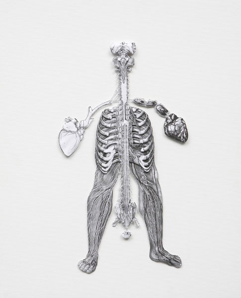
Kate Price
Untitled 2007
from the Anatomical life series
paper, wood on canvas
51.0 x 40.0 cm
Werribee Secondary College, Werribee
Art
Werribee Secondary College, Werribee
In this series I have been influenced by the drawings of Leonardo da Vinci. I wanted to develop a reconstruction of the human form by creating collages that represent an alternate form of the human body. I chose to use paper toile for its three-dimensional character, and the traditional black and white used in anatomical drawings to establish a connection to the human form. My fascination with the art of the Surrealists is reflected in the irregular juxtaposition of magnified sections of internal organs with external body protrusions to accentuate the human form.
Lyri Alton
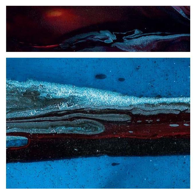
Lyri Alton
Toxicity 2007
inkjet print
( 1 ) 14.8 x 57.5 cm (image); ( 2 ) 11.5 x 57.5 cm (image) [detail]
McKinnon Secondary College, McKinnon
Art
McKinnon Secondary College, McKinnon
In order to progress, mankind has destroyed and corrupted anything that stands in its way. I sought to portray this toxic invasion in an abstract form, representing humanity as a dark, relentless force progressively dominating and overtaking the pristine blue of the world. After taking many photos of Melbourne on a beautiful day, I experimented by using spray-paint over acetate sheet, the chemicals mixing together to create different effects. I then scanned and printed the results. My images relate to my passion for the environment, reflecting the world today and the need for change.
Nicole Gooey
Nicole Gooey
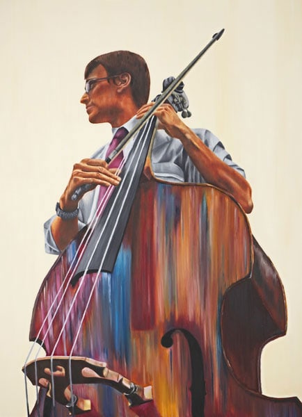
Stevie 2007
oil on canvas
167.0 x 122.0 cm
St Leonard’s College, East Brighton
Art
St Leonard's College, East Brighton
Stevie was created to explore my artistic view on relationships and how important they are in life. I decided to explore the bond between a musician and his double bass. My influences came from my own involvement in music as I learn and love the piano. I had attended a Melbourne Symphony Orchestra concert at the beginning of the year, after which I asked a member of the orchestra to be my model. I thoroughly enjoyed my journey of the development of Stevie and how my painting skills improved.
Deon Robertson
Deon Robertson
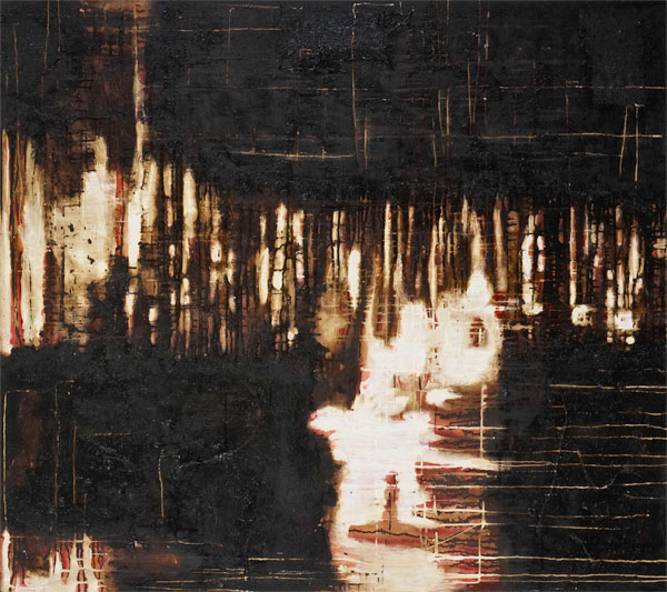
Black rain 2007
synthetic polymer paint, ink, chalk, shellac, hessian and bitumen on canvas
118.0 x 132.0 cm
Mount Clear College, Ballarat
Art
Mount Clear College, Ballarat
Direction and movement became the key focus in this work. Chance and pure creative play were my starting points. Colour was deliberately kept minimal to create a sense of the landscape, of dirt and of the earth. Mixed media exploration allowed a contrast between textural qualities, such as hessian to create line or pattern, and the rich flow of bitumen, oil, ink and shellac which gives a raw golden tone and haze to the painting. The richness of staining, rubbing back and dripping gives life to pure abstraction and above all it allowed me to control the uncontrollable.
Daniel Stojkovich

Daniel Stojkovich
Tower of Babel 2 2007
etching
17.0 x 13.0 cm (plate)
St Bernard’s College, Essendon
Art
St Bernard's College, Essendon
Inspired by the Renaissance works of Pieter Brueghel, in particular The little tower of Babel, 1564, this image is a modern interpretation intended to represent contemporary construction as a world of hubris and arrogance, and to create a link between skyscrapers and the biblical narrative of the Tower of Babel. Developed from an original photograph that I took, I manipulated the photo onto a zinc plate using high temperatures.
Hannah Morgan
Hannah Morgan
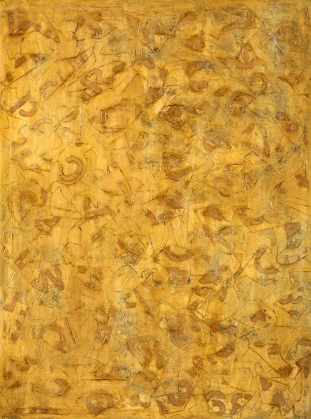
One of one 2007
paper, glue, synthetic polymer paint on canvas
122.0 x 91.5 cm
Ballarat Grammar, Wendouree
Art
Ballarat Grammar, Wendouree
Shape has always interested me because it can be used to create pattern in varied ways including repetition, sequence and contrast. Using shape as my starting point, I experimented with collage and trialled different painting techniques. I looked at works by Willem de Kooning and Jasper Johns and their use of random shapes. I created non-representational, layered works that were densely textured with layers of heavy paper and adhesive letters scattered across the picture surface. I used a light yellow to unify the work and black to outline the shapes, emphasising the textured quality.
Charles Ferry
Charles Ferry
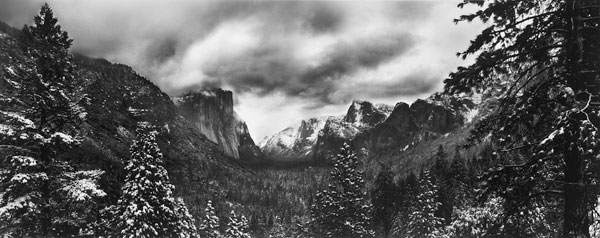
Yosemite Valley 2007
inkjet print
33.0 x 82.5 cm (image)
Melbourne Grammar School, Melbourne
Art
Melbourne Grammar School, Melbourne
I wanted to capture the magnificent beauty of winter in the Yosemite Valley in a more contemporary way than that of Ansel Adams and Edward Weston. I undertook a lot of research before arriving, and used a panorama format, digitally combining four images. I wanted to transport the audience to the Valley, to enable them to appreciate the awe-inspiring landscape, and to communicate how precious and fragile the planet is. The photograph’s sense of depth, perspective and sharpness was achieved by using a large aperture number and slow shutter speed.
Harry Aitken
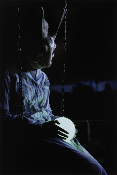
Harry Aitken
Entre chien et loup 2007
inkjet print
47.0 x 31.5 cm (image)
Trinity Grammar School, Kew
Art
Trinity Grammar School, Kew
This series focuses on what the French call entre chien et loup (literally: between dog and wolf). This is twilight, a time where light itself transforms. The sky turns a vivid blue as light fades. Street lights illuminate the landscape in an eerie glow. Menacing shadows expand into every crevice. It is the time between night and day. It is neither one nor the other. This period fascinated me immensely. I experimented by placing somnambulistic figures in suburban scenes and by erasing identity with various masks – trapping them between one day and the next.
Lauren McCormick
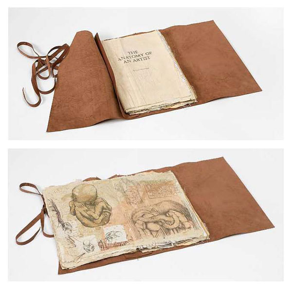
Lauren McCormick
The anatomy of an artist 2007
artist’s book: hand-coloured, eucalyptus photocopy transfers, oil paint, ink, pencil, coloured pencils, charcoal, pastel, on hand-made paper, 31 pages; cover: leather, stitched, leather binding
36.0 x 64.5 cm (open); 36.0 x 23.4 cm (closed)
Beaconhills College, Pakenham
Art
Beaconhills College, Pakenham
I explored a fascination with human anatomy and was inspired by Leonardo da Vinci. I wanted to better understand the mechanics of the body and human nature, investigating philosophical and surrealist aspects, not only the scientific perspective. The images also express ideas of growth and human interaction with the world. I used a variety of media – pencil, paint, pastel, charcoal and pen – and a range of techniques to make the book look old, including using tea to stain pages, integrating yellowed paper and raffia into the paper pulp, and water-washing pages with brown inks.
Aaron Hastings
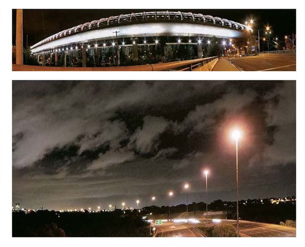
Aaron Hastings
Untitled series 2007
two inkjet prints
( 1 ) 13.0 x 59.0 cm (image); ( 2 ) 11.0 x 49.0 cm (image) [detail]
Koonung Secondary College, Mont Albert North
Art
Koonung Secondary College, Mont Albert North
I wanted to challenge the perception of the city being a busy place by depicting locations with minimal activity. I wanted to reflect a sense of absence while capturing the beauty of areas that could be seen as undesirable, using the contrast of light and dark, and the patterns created by streetlights all over the city against the night sky. I selected locations during the day and returned at night, set up a tripod and took multiple photos with long exposures capturing wide angles. Using Photoshop, I composed the final photographs by joining multiple images together.
Katherine Mason-Phillips
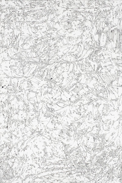
Katherine Mason-Phillips
Hurricane 2007
gesso, ink, fibre-tipped pen on board
90.0 x 60.0 cm
Mount Waverley Secondary College, Mount Waverley
Art
Mount Waverley Secondary College, Mount Waverley
My work centres around my discovery and recording of the patterns I see in my mind, and organic and artificial forms in the surrounding environment. I manipulated white gesso with my hands, applying it to a board and tracing over the dried surface with ink and pens. Hurricane expresses subtle, intricate details through texture and movement – the patterns seem to be flung around by some invisible force, churning and spiralling out of control. The triptych symbolises my secret obsessions and the comfort they bring, while appearing chaotic, ambiguous and elusive to the viewer.
Jackson Taylor
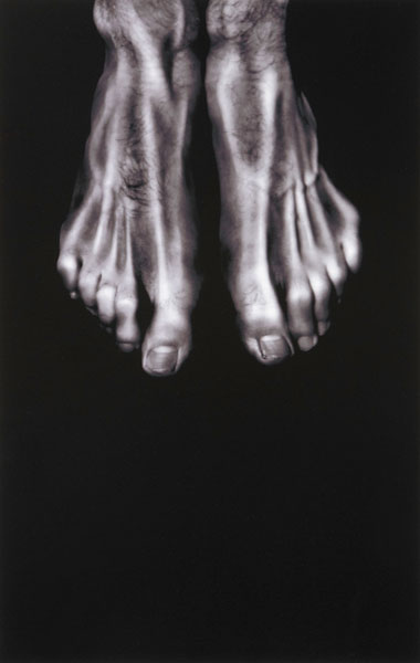
Jackson Taylor
Untitled 2007
inkjet print
43.8 x 28.0 cm (image)
Princes Hill Secondary College, Princes Hill
Art
Princes Hill Secondary College, Princes Hill
My work evokes feelings of loneliness, sadness, depression and psychological torment. Images of human body parts are distorted and appear motionless like statues. The work intends to trigger a response from the viewers, for them to recognise the possibility of such extreme feelings often repressed within themselves. I was influenced by William Blake’s paintings and writings, particularly the way he creates human form with his visual work and expresses anxiety and sadness in his poetry. To create the image I have used distortion tools in Photoshop.
Melanie Roach
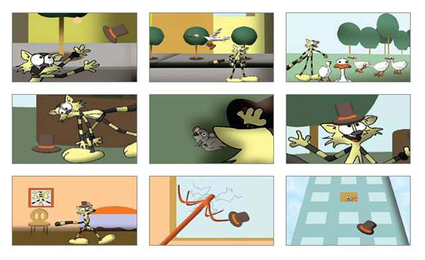
Melanie Roach
Pat’s new hat 2007
colour DVD, sound
3 min 30 sec
Gippsland Grammar, Sale
Art
Gippsland Grammar, Sale
My work is about the mascot of my folio, Pat the Cat. I made my first animations in primary school, mainly clay and clipbook animations. I was inspired by kid’s cartoons on television. I love to draw but, rather than drawing every frame by hand, I decided to work digitally to save time, using Anime Studio. I drew scenery, characters and body parts from various angles and digitised them using Corel. Adding music and final edit were in Adobe Premier. I learnt to use the programs as I went – it took months to complete.
Jessica Lisle
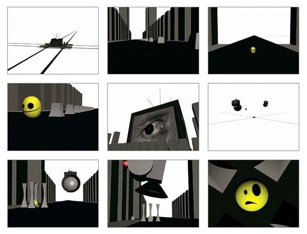
Jessica Lisle
Grey places 2007
colour DVD, sound
3 min
Ballarat Grammar, Wendouree
Art
Ballarat Grammar, Wendouree
My animation focuses on the way the media restricts individuality. Using symbolism, it follows the journey of an individual’s efforts to escape conformity. I created a distorted world, using the black and white of newspapers, with images of the cityscape and media control stripped down to the barest elements. I wanted audiences to relate to the character and I believe animation can tell the story more effectively than painting or a photo. I began with hand-drawn and Flash animation but decided to use 3D Studio Max with original music made in Fruity Loops Studio 5.
Matthew Fowler
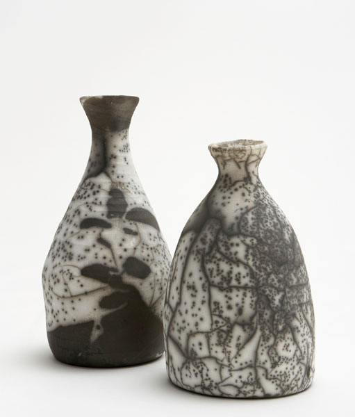
Matthew Fowler
Naked raku bottle series 2007
porcellaneous stoneware
( 1 ) 25.7 x 14.0 cm diameter; ( 2 ) 22.0 x 14.0 cm diameter
Camberwell Grammar School, Canterbury
Art
Camberwell Grammar School, Canterbury
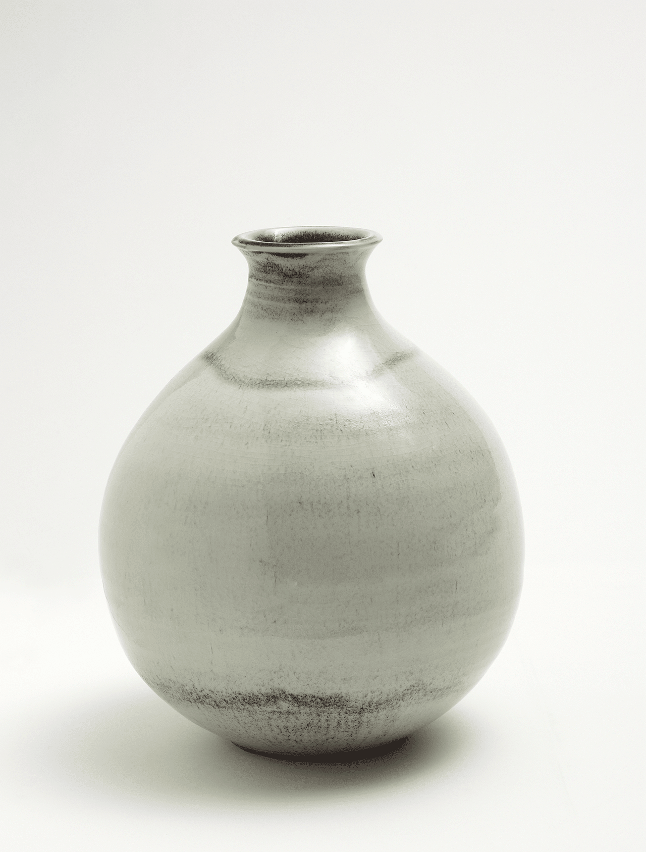
I was influenced by Japanese ceramics, particularly traditional tea ceremony wares. The raku firing process, developed in Japan over hundreds of years, is perfectly suited to this series of bottles. In the smoke-stained crazing pattern and raw finish of the pieces I aimed to achieve the Japanese paradox of imperfect beauty, a reflection of the uncontrolled aesthetics of nature. I utilised off-centre throwing and Shino glazing in a number of works and enjoyed the tension of each firing where the element of chance played a major role.
Alex Maisey
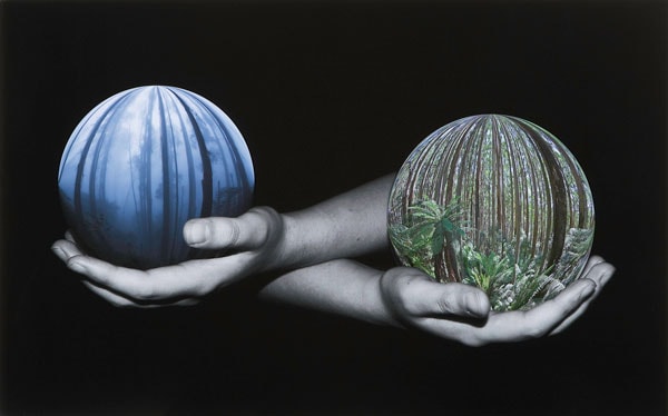
Alex Maisey
Conservation – The world is in our hands 2007
inkjet print
49.5 x 79.0 cm (image)
Monbulk College, Monbulk
Art
Monbulk College, Monbulk
My theme was the beauty of nature and how it is being both destroyed and conserved by human beings. As a conservationist I wanted to show a world worth protecting, prompting viewers into defending the environment against destruction and deforestation, and encouraging them to live in an environmentally friendly manner. I aimed to create images containing strong symbolic and artistic references. Conservation – The world is in our hands holds a message pertaining to balance and contrast, to illustrate the importance of stewardship of our planet, and appreciation of the richness of the life within.
Daniel Kamateros
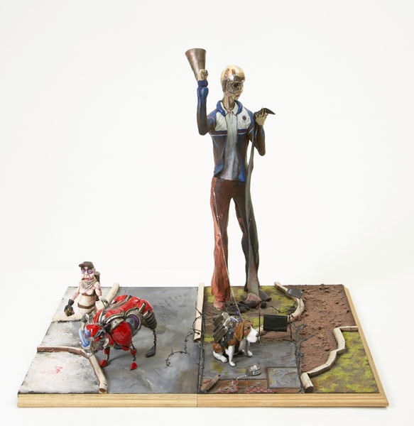
Daniel Kamateros
The park (detail) 2007
wood, modelling clay, synthetic polymer paint, resin, wire, tin foil, newspaper
78.0 x 123.0 x 80.0 cm
Viewbank College, Rosanna
Art
Viewbank College, Rosanna
I created an alternative world, a fantasy universe in the form of a park, reflecting the chaos of society. Each figure represents a facet of a warped or exaggerated culture. I sought to combine personal dream interpretation and unseen qualities of society. I sculpt miniatures as a hobby and used epoxy, polymer clay, modelling clay and dentist’s tools to make the larger works, developing my ideas in drawings. Figures and vignettes represent all the varied sources of inspiration throughout the year. The park provided an escape from the hectic pace of Year 12.
Rebecca Hayes
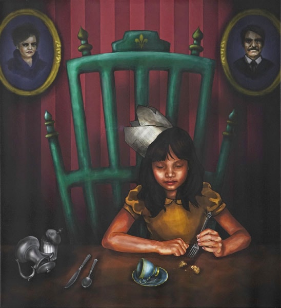
Rebecca Hayes
Tea time 2007
inkjet print on canvas
61.0 x 55.7 cm
St Monica’s College, Epping
Art
St Monica's College, Epping
Drawing inspiration from Alice in Wonderland, I produced portraits that tell a story, inviting the viewer to delve into a world of the everyday juxtaposed with fantasy and the imagination. Characters developed by completing detailed drawings from life, old family photographs and images of friends. Inspired by Paula Rego’s work, I created a heavily stylised series based on my cousin, Clarisse, using bold colour, gesture, props and symbolism. I combined contemporary processes with conventional painting techniques, using a graphics tablet and Photoshop, printing the images onto canvas to reflect my use of traditional portraiture.
Alexandra Apostolidis
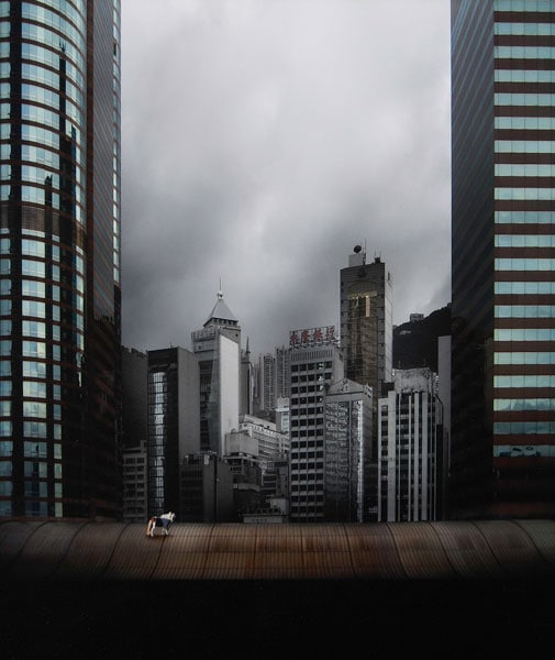
Alexandra Apostolidis
Nature versus man 2007
from The juxtaposition series
inkjet print
42.0 x 38.0 cm (image)
Camberwell Girls’ Grammar School, Canterbury
Art
Camberwell Girls' Grammar School, Canterbury
As I travel around our environment, I am constantly aware of the proliferation of huge buildings and the dilemma this poses for the lifestyle of both animals and humans. In my photograph I have created an artificial tableau which acknowledges this predicament, but also illustrates that some manmade constructions can be as beautiful as forms of nature. The juxtaposition of the horse and the buildings magnifies the distance between the two – can animals really exist in a built-up environment?
Dominique Taylor
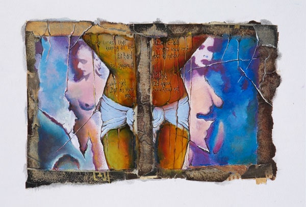
Dominique Taylor
Crucifixion of a model 2007
inkjet print, collage, oil stick, pastel, pencil, charcoal, wax, fibre-tipped pen, shellac
19.0 x 28.0 cm (image)
Centre for Adult Education, Melbourne
Art
Centre for Adult Education, Melbourne
This work was the first in a series revolving around a model’s life in the fashion industry. I explored the way models sacrifice themselves to the industry and the pressures that come with the superficial life-style, the suffering, distortion (mental/physical), rejection and pain (self-inflicted and inflicted upon them) that models go through. I looked at the media’s focus on issues surrounding weight, physical illness and unrealistic expectations. I wanted to reflect ideas of distortion and manipulation by using a range of material and techniques.
Lauren Wolfram
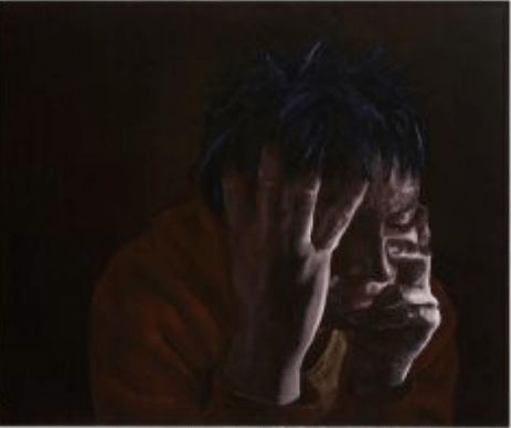
Lauren Wolfram
EM 2007
oil on canvas
101.5 x 122.0 cm
Koonung Secondary College, Mont Albert North
Art
Koonung Secondary College, Mont Albert North
My theme was the inner turmoil associated with the seven deadly sins. I was influenced by work on the Deviant art website and a group of Venetian masks, and decided to combine each of the emotions in a single subject. By using oil paint, I created depth and a layered, textured effect. I aimed to achieve the element of chiaroscuro as in Caravaggio’s work, although getting the balance between light and dark, so the figure emerges from the darkness, was challenging. The gestural brushstrokes indicated movement, contributing to the sense of barely restrained emotion.
Alexandra Sciubba
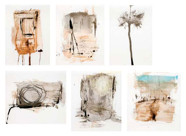
Alexandra Sciubba
Untitled 2007
synthetic polymer paint on polystyrene board
(clockwise from top left) ( 1 ) 14.5 x 11.0 cm; ( 2 ) 15.4 x 12.0 cm; ( 3 ) 15.2 x 11.0 cm; ( 4 ) 16.0 x 21.6 cm; ( 5 ) 14.2 x 12.8 cm; ( 6 ) 14.4 x 13.1 cm
Catholic Ladies’ College, Eltham
Art
Catholic Ladies' College, Eltham
All human beings have the inherent ability to perceive things in alternative ways. In today’s society, especially amongst the younger generation, the idea of conforming to a set standard is at its highest, with young people believing that conforming leads to acceptance. My ambiguous expressions represent the differences in each individual perception. They allow viewers to use their conscious thought, imagination and even their subconscious lack of awareness to interpret the simple images in any way they choose, giving meaning to the notion that we as human beings are all unique and inimitable in many ways.
Anastasia McNamara
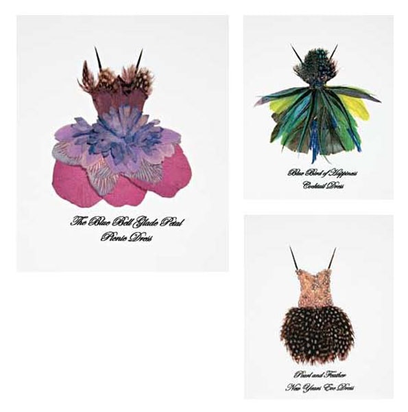
Anastasia McNamara
2007
images from Natural designs
artist’s book: inkjet print, 62 pages; cover: denim, board, feathers, sequins, cotton, gold thread, ribbon binding
30.0 x 43.0 cm (open); 30.0 x 21.5 cm (closed)
St Catherine’s School, Toorak
Art
St Catherine's School, Toorak
The book contains thirty designs, each using collaged materials provided by nature. The underlying inspiration is the female form and fashion, a celebration of the beauty of nature through couture. I worked to understand and experiment with the materials, for example the curve of a feather or shell, or the lines of a leaf. Garments were produced on paper, individually photographed and then printed to create two-dimensional images of a three-dimensional design, revealing the detail and texture of each material. Shadowing was removed digitally, and the designs were divided seasonally to emphasise the different materials.
Stephanie Stathopoulos
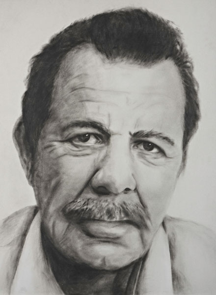
Stephanie Stathopoulos
Pappou 2007
oil on cardboard
102.0 x 76.0 cm
Alphington Grammar School, Alphington
Art
Alphington Grammar School, Alphington
My work this year focused on realistic portraiture. I wanted to create a personal and tangible memory of the way my grandfather looks and which reflects his personality, mood and life experience. I intended to use the paint in a way that emulates drawing. I have always admired artists such as Chuck Close who have the ability to create realistic images, and this is why I did not change the natural proportions of my subject matter. My grandfather’s (Pappou’s) face is so full of character and because I am so close to him I wanted to paint him.
Calum Alexander
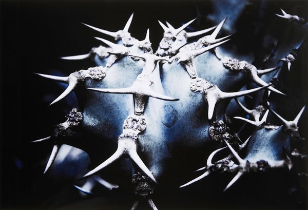
Calum Alexander
Tiny dancers 2007
inkjet print
33.0 x 48.3 cm (image)
Melbourne Grammar School, Melbourne
Art
Melbourne Grammar School, Melbourne
I captured closely the simple aesthetics of nature so the photo was free of any unwanted details. By doing this, I could turn something bland into something sublime.
Ruby Pilven
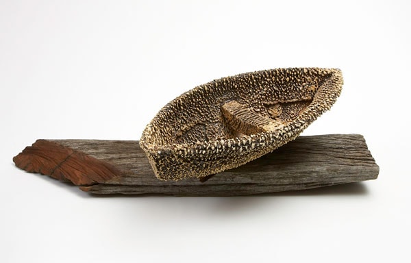
Ruby Pilven
Weathered vessel 2007
stoneware
40.0 x 50.0 x 30.0 cm
Ballarat High School, Ballarat
Art
Ballarat High School, Ballarat
I focused on the devastation of the drought and its effects on every aspect of life. It inflicts deprivation upon the mental, physical, social, economical, environmental, psychological and financial aspects of daily life. On our rural property we rely on rainwater for our water supply. I looked at historical accounts of hardship during earlier droughts and also witnessed Ballarat’s Lake Wendouree completely dry up. I adopted a variety of techniques, for example, tearing the clay, layering slip and washing black oxides to create the vessel. I then fired it in a wood kiln
Stephanie-Lee Moulin
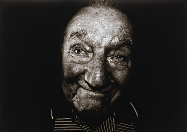
Stephanie-Lee Moulin
Untitled 2007
from the Decay series
inkjet print
40.5 x 58.0 cm (image)
St Helena Secondary College, Eltham North
Art
St Helena Secondary College, Eltham North
Within my work I have aimed to challenge the conventional perceptions of decay and the ageing process through the study of portraiture. An elderly person with their lifetime tucked within the deep crevices of their face is my representation of the beauty in decay, a means to display and honour the result of passed time. Rather than using digital manipulation to erase the marks of time, a craft of modern society, I used it to emphasise them, and to reveal a message that stands against widely accepted perceptions and effectively honours life coming full circle.
Laura Griffin
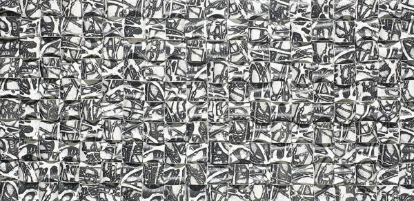
Laura Griffin
Intertwined 2007
photocopy, polystyrene board
51.0 x 102.0 x 3.0 cm
Beaconhills College, Pakenham
Art
Beaconhills College, Pakenham
My VCE year exploration focused on creating textural and rhythmic qualities through the expressive use of line. Experimenting with glue to create a collograph, I found the technique worked well, creating expressive line work and giving a beautiful tactile texture. At the Australian Print Workshop I was able to print on a larger scale to create more visual impact. In my piece Intertwined I emphasised the intense line work and the tactile texture of the collographs I had created, by paper folding/weaving, using coloured photocopies of an original print.
Alex Goad
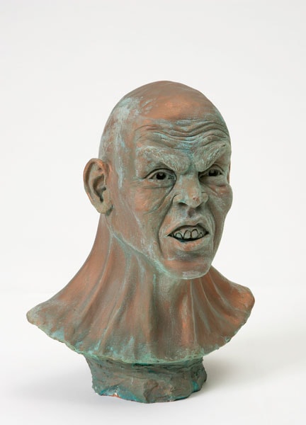
Alex Goad
Fury 2007
earthenware
36.5 x 28.4 x 21.5 cm
Wesley College, Melbourne
Art
Wesley College, Melbourne
I’ve worked with clay for a number of years and sought to capture the differences and complexities of the human face. I aimed to portray facial expression through movement and in turn used the expressions and movements of those around me as inspiration to help create this. I used photography to record areas of the face and body to further influence the creation of Ôfury’ and to gain a detailed perspective of such facial details as wrinkles, veins and skin pores. Fury represents the ferocity of human expression.
Leo Bagus Purnomo

Leo Bagus Purnomo
Synthesis of self 2007
bark, glue
96.0 x 87.5 x 104.0 cm
Macleod College, Macleod
Art
Macleod College, Macleod
This work was inspired by the concepts revolving around the conscious exploration of identity or self. The figure is synthesising itself from pieces of bark. These pieces represent the different beliefs and characteristics which make up an individual. The different aesthetic qualities of bark reflect the various traits and their natures, whether they are unpleasant or more picturesque. The figure’s head is detached, reflecting the need to detach ourselves and become objective to properly articulate and understand ourselves. Lastly, the figure is deteriorating, reflecting the futility of the search for a concrete answer.
Keli-Jo Murray
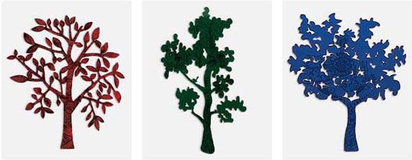
Keli-Jo Murray
Tattooed trees 2007
synthetic polymer resin
( 1 ) 45.6 x 41.0 x 0.3 cm; ( 2 ) 47.0 x 27.0 x 0.5 cm; ( 3 ) 47.0 x 39.4 x 0.3 cm
The Peninsula School, Mt Eliza
Art
The Peninsula School, Mt Eliza
Using a traditional industrial machine, a laser cutter, I combined natural and un-natural art forms to develop works using lines and patterns found in our everyday surroundings. I focused on patterns that are often overlooked, such as the structure within trees. I wanted to see the effect of taking one form of pattern and replacing it with another, unexpected one. Using the laser machine to cut and engrave, I was able to imprint the patterns onto the surface of the acrylic sheet in a fine and detailed way. I then carefully cut out each tree.
Anthony Mariani
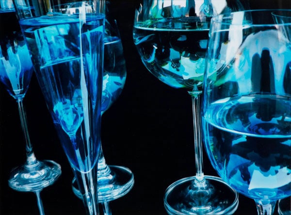
Anthony Mariani
Glasses 2007
inkjet print
29.0 x 39.0 cm (image)
Salesian College, Chadstone
Art
Salesian College, Chadstone
My intention was to display the natural qualities and aesthetic possibilities of glass. I placed glass objects in different situations, experimenting with materials such as blue-toned water. I used digital photography and Photoshop to enhance colours and re-size images. My main objective was to display how something so simple, such as glass, can be turned into something so interesting. The use of differently shaped glasses creates an effect that is aesthetically pleasing and generates individual beauty. While each of the individual glasses has its own unique character, all together the glasses create something more.
Mairéad Dwyer
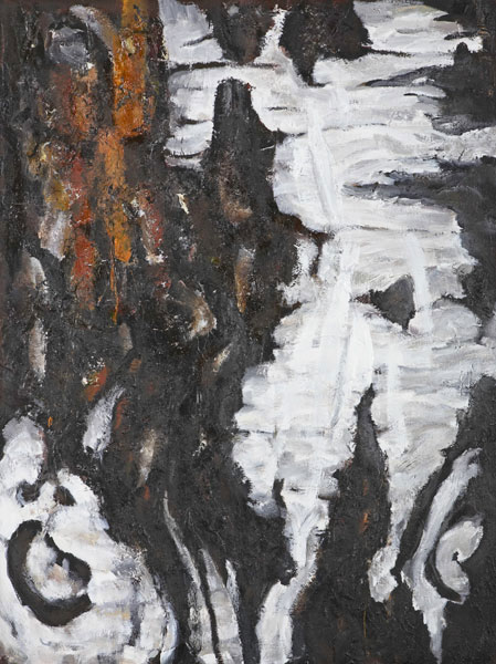
Mairéad Dwyer
The art tree (Patterns from a silver birch) 2007
synthetic polymer paint, textile, impasto, glue, wax, tempera and shellac on canvas
101.5 x 76.0 cm
Ballarat & Clarendon College, Ballarat
Art
Ballarat & Clarendon College, Ballarat
This painting was inspired by the dynamic patterns, colour and texture found in the bark of a silver birch just metres from our art room. I wanted to show the variety and detail in nature, the basis, I believe, of conventional beauty and original design. Taking this beauty out of context, I created abstracted surfaces founded on perfectly formed details. I achieved a richly textured surface through experimenting and layering with many media including wax, glue and shellac, imitating the bark. Layering and contrast added depth, allowing light to play across the surface of the works.
Cassie Meadows
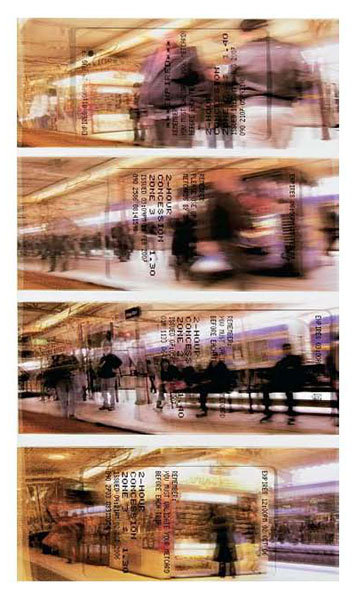
Cassie Meadows
This side of the tracks 2007
four inkjet prints, acetate
6.5 x 14.5 cm (image) (each)
Monbulk College, Monbulk
Art
Monbulk College, Monbulk
This work explores the validation of a moment and the different reactions a viewer may have to a moment, due to experience. I looked at the creation of different feelings, opinions, moods and memories that an image may trigger due to personal experiences. The Metcards communicate the validation part of my ideas, as the time and date are printed of the surface of each photo. This work is part of a series using public transport as a starting point. Travelling with friends or complete strangers got me thinking about what connects us in the modern world.
Hiran Silva
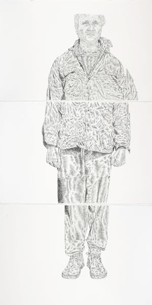
Hiran Silva
Stippling family 2007
fibre-tipped pen on watercolour paper
66.5 x 102.5 cm (image) (each)
John Paul College, Frankston
Art
John Paul College, Frankston
I have always been interested in the fine detail of drawing and for this work I was inspired by the art of Noli Novak and Joe Richards, who created stippled portraits of geometric and organic subjects. The technique of stippling and cross-hatching allowed me to create a finely detailed, life-size portrait with emphasis on the three-dimensional form. The imagery I have created brings together aspects of my family and passion for creating subtle imagery that has influenced my life.
